
A focused rebrand to be as bold as their mission
New brand, website, and packaging to stand out
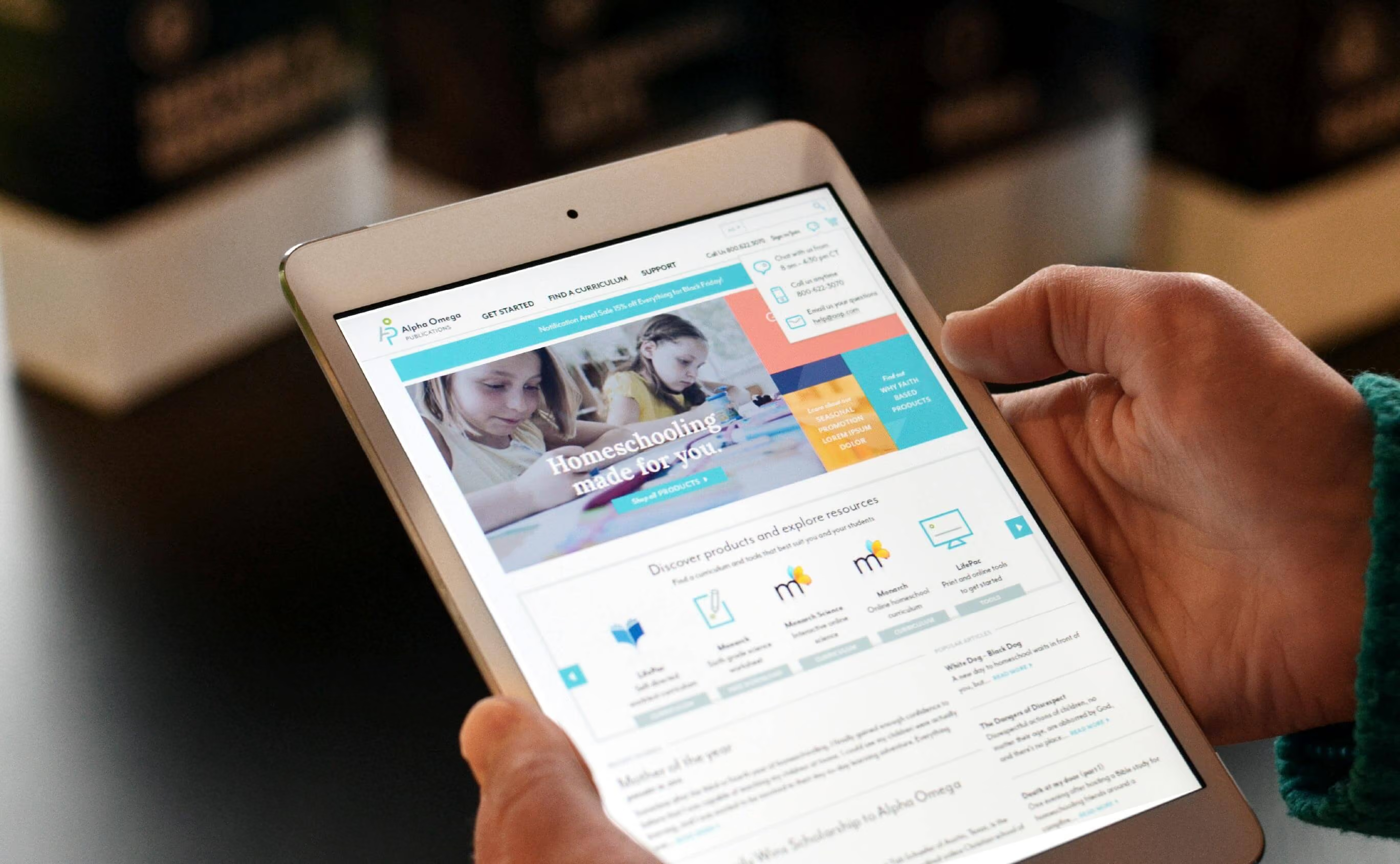
Founded in 1977, Alpha Omega Publications (AOP) is a leading provider of PreK-12 Christian curriculum, educational resources, and services for Christian schools and homeschool families worldwide, reaching thousands of students through curriculum, educational books and games, support services, and an accredited online academy.
As competition in the homeschool curriculum market grew, AOP realized its branding no longer reflected its mission to enrich not just the education of homeschooled children, but their lives, so Vervint mined customer insights to build a new brand identity, website, and product packaging from the ground up.
Build a brand that reflects the mission
Create an identity that feels approachable, empowering, and passionate, not just visually updated.
Make the website do the selling
Help existing customers quickly find and order what they need while giving new homeschool parents the information to compare curriculums and choose confidently.
Carry the brand all the way to the shelf
Extend the new look and feel into product packaging and booklet design, not just digital touchpoints.
A brand built around a student at a desk
Vervint designed a subtle but clever logo treatment featuring the letters A, O, and P, forming the visual of a student at a desk, paired with a palette of vibrant, youthful colors and an icon set that applies that same smart, colorful, minimalistic style to familiar education subjects.

Carrying the brand from screen to shelf
With a strong brand identity established, Vervint brought the new look and feel to AOP’s website, the company’s primary sales tool for homeschoolers across the country, focusing on helping existing customers find and order what they needed quickly while giving new homeschool parents the information to compare curriculums and decide what their children needed. From there, Vervint extended the brand into the packaging and booklet layouts of AOP’s popular LIFEPAC curriculum, creating packaging that draws consumers in with eye-catching design and gives them the information to make an informed decision, plus booklet designs with intuitive layouts, comprehensible illustrations, and generous white space for note-taking.
With a brand as bold, vibrant, and youthful as the students it serves, AOP is positioned to keep standing out in a crowded market while staying true to its mission of enriching kids’ education, and their lives.