Save Time, Build Customized Features, and More in Xamarin Forms
Building mobile apps with Xamarin Forms can save you and your team significant amounts of time by allowing you to create Android and iOS variants of your application at the same time. However, some of Xamarin’s built-in components are missing design features and functionality that users have come to expect. Unfortunately, hand-coding these features can take a lot of time and effort.
For example, have you ever tried to create an entry with icons for clearing the text or for showing and hiding passwords? How about styling an entry with an underline like Google’s Material Design? Have you ever wanted to specify what action takes place when the user presses the return key on the keyboard? Have you ever tried to code an entry placeholder that animates into a label that floats above an entry when it has focus?
All of these functions (and more) can easily be built with UltimateEntry and FloatingLabel from Vervint’s free PhantomLib library in GitHub. These tools are a huge time saver compared to implementing these features yourself. In addition, using modern styling like material design and other custom features will set your app apart from others and provide a more delightful user experience. People will be more likely to continue to use your app and rate it higher.

A Developer’s Review of Popular Mobile App Frameworks
Create a Floating Label in Xamarin Forms
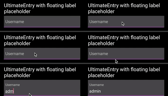
The floating label pattern started on web pages and made its way to mobile apps a while later. When the screen is first rendered, the placeholder is shown on the entry as it would with a regular entry control.
Using the open source code in PhantomLib, when the UltimateEntry receives focus, the placeholder text will resize to a smaller font and animate up to make room for the text that the user enters. This way, if the user forgets which field they are filling out, the placeholder is still visible. If the user doesn’t enter any text and the UltimateEntry loses focus, the placeholder will animate back down to its original position and the font will change to its original size.
In order to achieve the floating label effect, you can use a combination of the FloatingLabel control linked to an UltimateEntry. To link them together, simply set the UltimateEntry property on the FloatingLabel to a reference of your UltimateEntry control like this:
<controls:FloatingLabel x:Name=“UsernameFloatingLabel” PlaceholderText=“Username” UltimateEntry=“{x:Reference FloatingUsername}“>
Below are some of the FloatingLabel’s bindable properties:
- PlaceholderColorProperty: This allows you to set the color of the placeholder text. With Xamarin, you typically set colors up either in the App.Xaml file or by creating a custom class. They can be in RGB or hex, but they get converted to a Xamarin.Forms.Color class.
- PlaceholderTextProperty: This defines the text of the placeholder.
- FocusedBackgroundColor: This is the background color used when the control has focus.
- UnfocusedBackgroundColor: This specifies the background color used when the control does not have focus.
- FloatingPlaceholderFontSize: This defines the font size that the placeholder will have when it is floating.
- FloatingTextEaseProperty: This describes the easing to be used when the placeholder animates. “Easing” is a Xamarin.Forms class that you use to control how an animation works. It can go from top to bottom, left to right, etc. Any time you create animations in Xamarin, you need to specify an easing.
- FloatingSpace: This is the amount of vertical space allocated to the placeholder when it is floating.
Here is an example of what the floating label looks like in the app:

GitHub Gist for Xamarin Form Floating Label
How to Add a Function to Clear the Contents of a Form Field in Xamarin
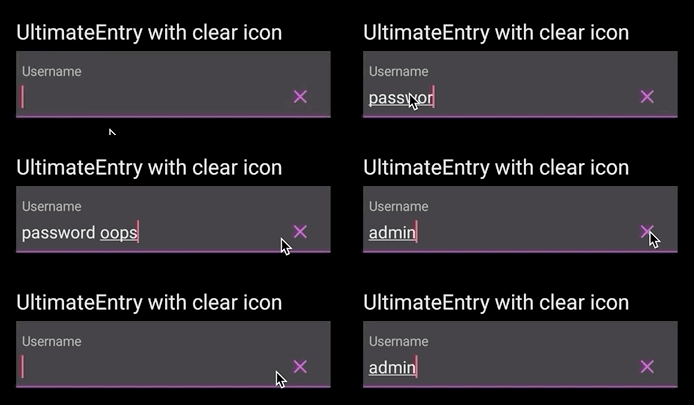
Adding an icon to the right of an entry that clears the text when it is tapped is very simple to do with an UltimateEntry. You can specify any icon you want to use. Typically, you add icons and other images in the platform-specific layers for iOS and Android. Then you can set up the UltimateEntry’s properties using the settings below:
- ImageButton= “ClearContents”
- ImageSource= “your_image_source”
The clear-contents feature can be used with or without a floating label. Below is a sample of what a clear-contents button looks like in an app with a FloatingLabel.

GitHub Gist for Clearing an Entry in Xamarin Forms
Show and Hide Passwords in Xamarin Form Fields
Typing passwords in a mobile app can be frustrating, especially when creating an account that requires you to do it twice. One way to make this easier for users is to provide a button that will show and hide the password. This allows users to verify that they typed it correctly.
You can add this functionality to your mobile app with ease by setting 3 properties on the UltimateControl:
- ImageSource= “your_locked_image”
- HidePasswordImageSource= “your_unlocked_image”
- ImageButton= “Password”
The ImageButton property specifies what action should be performed when the user taps the icon. By setting the value to Password, the custom renderers know to show or hide the contents of the UltimateEntry, depending on its current state.

GitHub Gist for Showing and Hiding a Password in Xamarin Forms
Create Underline Styles in Xamarin Forms That Look Like Google’s Material Design
Xamarin Forms has a feature called “Visual” that allows you apply styling across multiple controls. Microsoft provides a material design theme to go with Visual to give some of your controls the look of Material Design.
If you want to style your entries with the Material Design underline without installing Visual and the Material Design nuget packages, you can set a couple of properties on an UltimateEntry and be done. This could have the added benefit of reducing the size of your app, depending on your linker settings.
Set the following property for the underline:
- UnderlineColor= “Fuschia”
Then you can set optional properties for other colors:
- FocusedBackgroundColor= “{DynamicResource AccentColor}”
- BackgroundColor= “{DynamicResource PrimaryColor}”

GitHub Gist for Material Design Underline Style in Xamarin Forms
Specify What the Return Button Does in Xamarin Forms
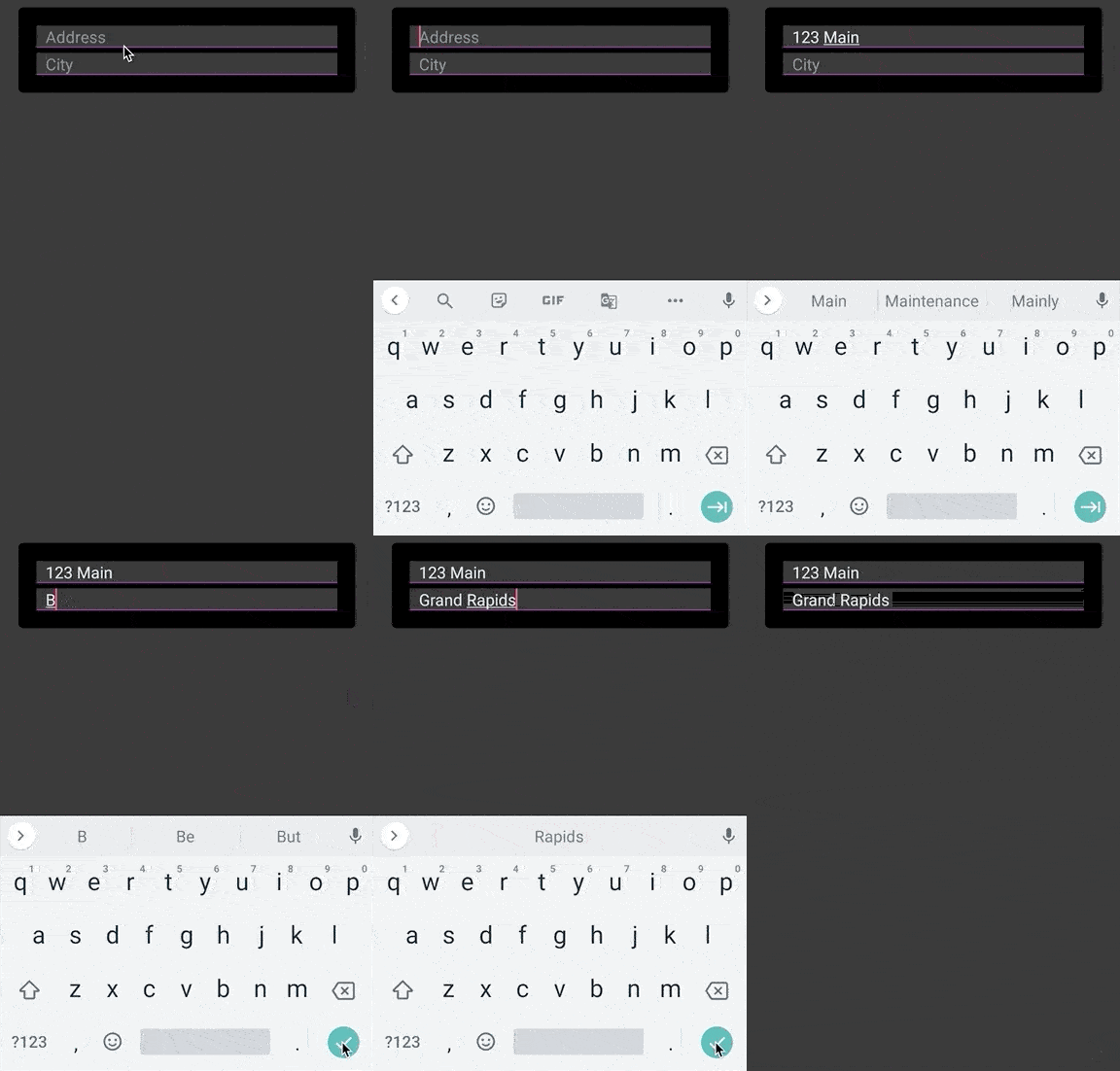
Using the ReturnButton property on the UltimateEntry control, you can specify if you want the return button on the keyboard to signal the end of editing (done), go to the next control (next), or execute a search (search).
Behind the scenes, the custom renderers implement this feature because it must be done at the platform-specific layer. All you need to do is set the ReturnButton and NextView properties, as shown in the example below.

GitHub Gist for Return Button Behavior in Xamarin Forms
Save Time and Improve User Experiences With Your Xamarin App
If you’re struggling to build, maintain, and update your mobile app (or get the data, functionality, and results out of it that you need), the team at Vervint is here to help. Learn more about our mobile app development services and get in touch with one of our experts today!


