
Empowering Patients Through Mobile Apps
Breakthrough, an app that connects patients with therapists, wanted to help people find therapists, schedule appointments, and make conducting sessions easier. Learn how Vervint created a digital breakthrough for the mobile therapy provider.
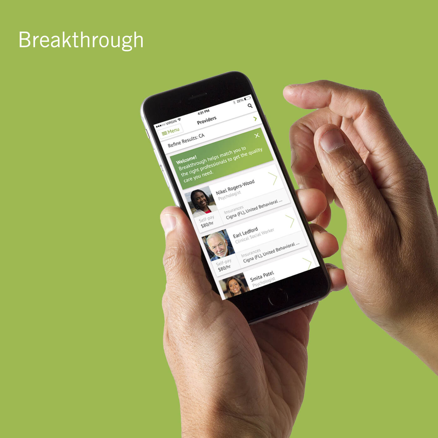
What We Did
Breakthrough wanted to help people find therapists, schedule appointments, and make conducting sessions easier. Vervint created a digital breakthrough for the mobile therapy provider, redesigning their user experience and app.
Customer Insights
App Development
Experience Design
About Breakthrough
Breakthrough, a Silicon Valley-based startup, provides accessible mobile counseling that allows patients to connect with licensed healthcare providers outside of the traditional therapist office environment. The organization aimed to help people find therapists, schedule appointments, and make conducting sessions easier.

Insight: Mobile App Accessibility Guidelines, Strategy and Examples
A Different Kind of Breakthrough
When patients need help, it’s essential that they’re able to find a therapist and schedule an appointment quickly and easily.
When Breakthrough needed to make their app and user experience better for patients turning to them for care, Vervint helped the company create a digital breakthrough of their own.
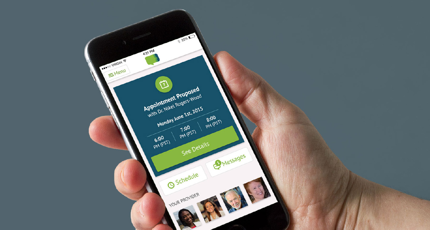
Designing for Patient Ease
Breakthrough sought to enable patients to browse therapists by specialty, schedule appointments, and conduct live sessions with therapists by videoconferencing.
Framing the challenges of app users was key for Vervint, as some patients might be at risk for harm, and connecting them with care quickly and easily was a clear priority.
However, many Breakthrough users were limited to older systems and were unfamiliar with common UI patterns. Considering these users, Vervint aimed for directness and clarity in functionality and visual design. The goal was for patients to feel comfortable and confident using the app.
The team examined multiple user paths to create seamless interactions that felt intuitive to the user, even for those unfamiliar with a contemporary user interface.
A card system provided intuitive usability and easy access to information. Subtle background colors and a handful of different type weights created a visual hierarchy that helped a user to navigate between screens. By creating simple styles early in the process, Vervint was able to carry visual consistency throughout the application.
Files prepared at multiple screen resolutions for different user devices and a detailed UI Style Guide gave developers the flexibility to control consistency and offer a framework as they continued to build and grow.
With the app’s launch, Breakthrough improved the user experience for patients, helping them find a therapist, schedule an appointment, and conduct sessions with ease.